

Justlife Promises More Time and Fewer To-Dos in Latest Dubai Campaign

The to-do list is the product insight behind Justlife’s latest Dubai DOOH campaign. Cleaning, appointments, and household jobs compete for attention long before anyone opens a booking platform. Justlife brings that familiar pressure onto digital screens with “Break free from your to-dos,” positioning its services around the relief of handing tasks over. Unveiled in the second week of October, the campaign gives an everyday frustration a prominent place in the city’s outdoor advertising landscape.
The To-Do List Becomes the Hook
The approach continues a theme from Justlife’s previous OOH campaign, keeping unfinished tasks at the centre of its communication. That continuity gives the brand a recognisable territory to develop: the moment when everyday responsibilities start feeling like too much. The latest execution translates this tension into a short invitation that works without a detailed service explanation.
For content marketing, this creates a useful organising idea. A broad service offering can become difficult to communicate when every category demands space. The to-do list brings those needs together through a shared customer experience. It gives Justlife a message that can extend across different services while remaining focused on what the audience wants to resolve.
Blue Screens, Bold Branding, Short Copy
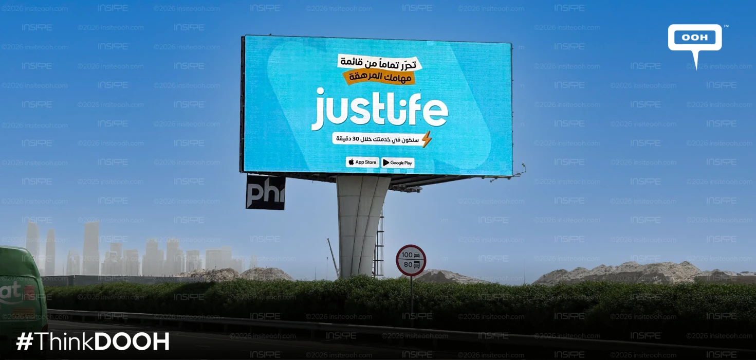
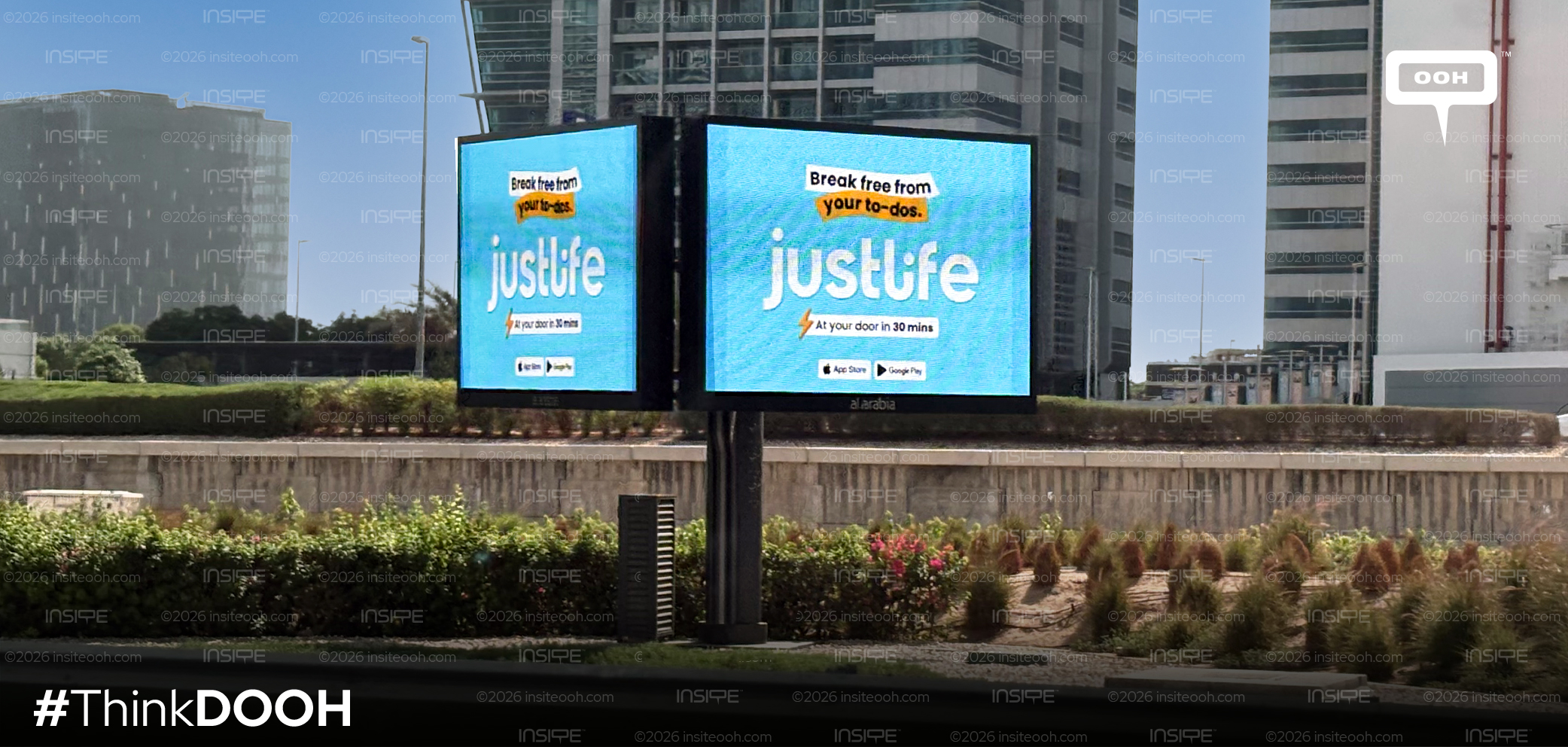
The photographed executions use a bright blue background and an oversized white Justlife wordmark. Above it, the headline appears on contrasting white and orange strips, echoing the appearance of a quick reminder. The orange highlight draws attention to “your to-dos,” giving the source of frustration its own visual emphasis before the brand presents itself underneath.
This hierarchy suits the conditions of roadside viewing. The creative offers three main reading points: the task-related headline, the brand name, and the speed message. App Store and Google Play badges sit below, connecting awareness to the mobile app. Their presence identifies the next step without requiring a lengthy booking explanation on the screen.
The supplied images show the design adapted to an elevated landscape billboard and paired roadside screens. English and Arabic versions retain the same colour palette and visual structure, helping preserve recognition across executions. The format changes, but the central message remains easy to identify. These photographs demonstrate layout consistency; they do not establish animation or a sequence of rotating service messages.
A Time Promise Meets the Commuting Mindset
“At your door in 30 mins” gives the English creative a concrete response to the headline’s emotional appeal. A lightning symbol reinforces the emphasis on speed, while the Arabic execution carries a corresponding time-based message. The claim makes immediacy part of the campaign’s positioning, giving viewers a specific promise to associate with the brand.
The outdoor setting adds relevance because audiences may encounter the message while travelling between responsibilities. A reminder about unfinished tasks can connect with that mindset, making the platform easier to recall when a need arises. Justlife’s DOOH approach turns a broad convenience proposition into a repeatable brand association: an accumulating list, a recognisable blue screen, and the possibility of getting help.
Come on, tell us what you feel about this article.