.jpg)

50 Years of Trust: Elezaby Marks Its Golden Anniversary with a Landmark OOH Campaign
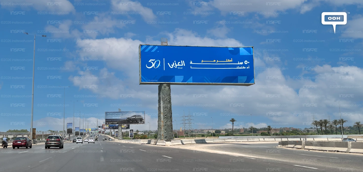
Elezaby Pharmacy is marking its 50th anniversary with a striking new outdoor advertising campaign that has transformed Cairo's highways into a powerful celebration of five decades of trusted care, proving that a minimalist creative execution can make one of the boldest brand statements on the road.
Commanding attention across Cairo's skyline, the dual-billboard execution employs a sophisticated color-blocking approach that elegantly reflects Elezaby's multifaceted brand identity. The first canvas is enveloped in a deep, authoritative pharmaceutical blue, immediately evoking trust, expertise, and clinical reassurance, while the second billboard introduces a vibrant leaf-green palette that symbolizes wellness, vitality, and everyday healthy living. This intentional visual contrast allows the campaign to speak to two complementary consumer needs, providing dependable healthcare solutions when they matter most while reinforcing Elezaby's broader commitment to preventive care and holistic well-being.
What truly elevates this campaign from a standard corporate milestone into creative brilliance is the innovative manipulation of typography and linear graphics. Instead of relying on passive text, the layouts integrate an elongated, fluid line that stretches dynamically across the Arabic script. On the blue board, the tail of the word (years) extends across the frame like a literal timeline, visually reinforcing the brand’s enduring half-century legacy and its massive network of over 500 branches. Meanwhile, on the green board, a sharp blue horizon underlines the copy, anchoring the message that everything you need is in one place. These lines serve as visual bridges, guiding the commuter’s eye smoothly while symbolizing an unbreakable continuity of care.
Every minor element is calibrated for peak efficacy at high speeds. The brilliant golden-yellow typography provides a high-contrast punch against the solid backdrops, ensuring the metrics of success are instantly readable from a distance. Subtly embossed behind the main text are abstract geometric patterns, faint leaf veins and intersecting arcs, that add artistic depth without creating cognitive clutter. Anchoring the entire composition is a sleek, stylized "50" anniversary emblem nestled right beside the classic brand logo. By bypassing distracting photography and leaning heavily into clean geometry, color psychology, and structural typography, Elezaby has brilliantly translated fifty years of heritage into a crisp, unavoidable statement of omnipresence.
Check out Monitoring Out of Home (MOOH), a specialist media intelligence agency and analysis system active in Cairo & Dubai, to learn more about this campaign.
Come on, tell us what you feel about this article.

Learn about this campaign budget, media plan, campaign data
.jpg)