.jpg)

Mountain View’s Creekview Finds Its Place Across Egypt’s Billboards

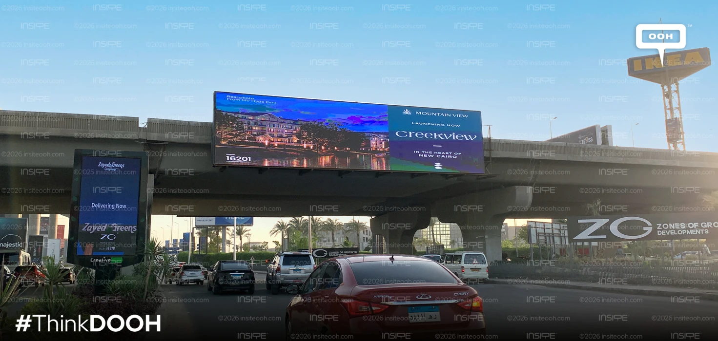
The latest residential project by Mountain View, Creekview, has been launched with an elaborate out-of-home campaign which puts the project identity in the limelight. Featuring large-format billboards, bridge wraps, digital displays, and high-end roadside advertising, the campaign heralds the launch of Creekview with a clear-cut visual expression centered around the message “Creekview – In the Heart of New Cairo”.
What underpins the whole campaign is the use of the simple approach in the creative process. The name of the project is given prominent placement in each advertisement, thus making the elegant serif wordmark the focal point of the campaign. Copy is kept to the minimum to ensure maximum legibility both at a distance and at high speeds.
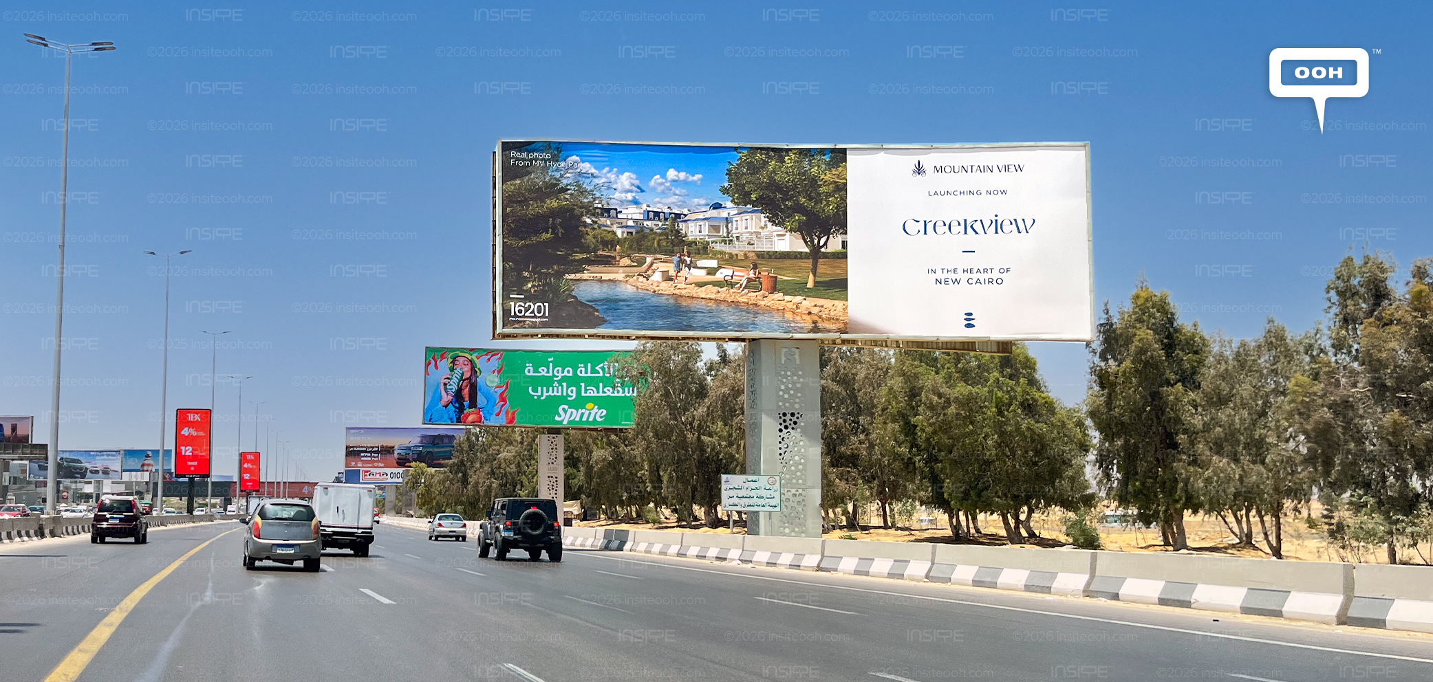
In terms of creative, the campaign uses a sophisticated color scheme that features only three colors: deep navy, white, and green tones inspired by the landscaping and water elements in the project. This palette not only contributes to creating a feeling of relaxation but also helps convey the luxury image of the development. Various images of luxurious living are used throughout the campaign to give an impression of Creekview atmosphere.
Creekview’s OOH campaign also shows great versatility when it comes to formats used to communicate the message. For example, when it comes to bridge wraps, Mountain View makes sure that branding and the message are kept separate, giving breathing room to both of these while ensuring unity throughout the structure.
On the other hand, stand-alone billboards alternate between hero visuals and type-driven layouts. The digital screens add to the campaign by featuring the same creatives in rotation while maintaining consistent visual identity, which allows for recognition of the project in any format.
An important part of the campaign is consistency in the use of whitespace. Instead of packing all space with graphics, the layouts allow white space to appear around the branding and the visuals, resulting in aesthetically pleasing and premium campaign. This campaign goes well with the identity of Mountain View, like their previous OOH campaign for Crysta.
Moreover, an interesting aspect of the project is the typography. The choice of the elegant serif font “Creekview” gives a soft and residential character to the project, while the clean sans-serif provides good support.
Also, the consistency of the OOHs is high, all having a unified look. This is thanks to the careful selection of fonts, design simplicity and imagery, through which the campaign is able to confidently introduce the development without overshadowing its own branding and sense of place.
To find out more about the campaign’s types, locations, budgets, media plans, and more, visit MOOH, the monitoring out-of-home intelligence data provider in Cairo and Dubai.
Come on, tell us what you feel about this article.

Learn about this campaign budget, media plan, campaign data
.jpg)
.jpg)