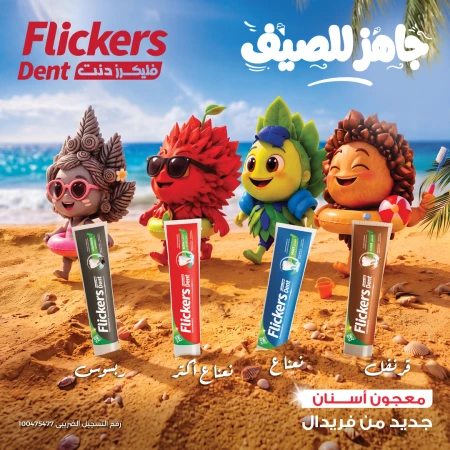
In the Egyptian real estate market, Wealth Plus Developments has established its presence as one of the main players with more than eight years of expertise, releasing a series of billboard across the city following their prior OOH appearance. Wealth Plus Developments has been a part of the market since 2002, and they always bring something new to the table with their portfolio of high-end projects that balance function and design. The group gives its projects a unique architectural style and a commitment to quality. This makes them not just buildings, but also long-term investments in a sector that is becoming more competitive. Wealth Developments' newest billboard campaign shows a consistent and very controlled visual identity on major roads in Cairo. The ads use a small number of colours, mostly deep blues and metallic tones, and a central shape that looks like a cube with a glowing cross-like symbol on it. The composition is simple, with most of the elements set against a clean, gradient background and framed by decorative borders. The copy does the same thing. There are short, repetitive phrases like We Add More, More Is Coming, and We Add More... Again in different places. The wording is purposely vague and doesn't mention any specific projects, places, or features. The messaging doesn't go into detail about what is being offered; instead, it focuses on the idea of adding or expanding all the time. This mix of abstract language and images moves the campaign away from traditional real estate ads. There are no pictures of buildings, pictures of people living their lives, or descriptive selling points. Without these parts, brand positioning becomes more important than product-specific communication. Using the cube as the main part of the design gives it a sense of structure and containment. The lighting and gradients, on the other hand, give the impression of depth and dimension. The object isn't explained directly, so it works more as a symbol than a real thing. This fits with the overall tone of the campaign, where consistency is more important than clarity. The size and location of the billboards also affect how people react to the campaign. The designs are best for quick reading when they are placed along highways and other busy areas. The big letters, high contrast, and small amount of text make sure that the message can be understood in a matter of seconds. In the real estate industry, the campaign is part of a larger trend toward simpler, brand-led communication. Wealth Developments uses tone and consistency instead of detailed explanations to position itself by cutting down on visual clutter and limiting the amount of information it provides. From a branding perspective, the repetition of “more” becomes the defining element of the campaign. It establishes a simple, memorable association with the company, while leaving room for interpretation. In this context, “more” can refer to scale, value, or future developments, without committing to a single meaning. To learn more about OOH campaigns in Egypt, visit MOOH, your local OOH intelligence data provider with international standards.