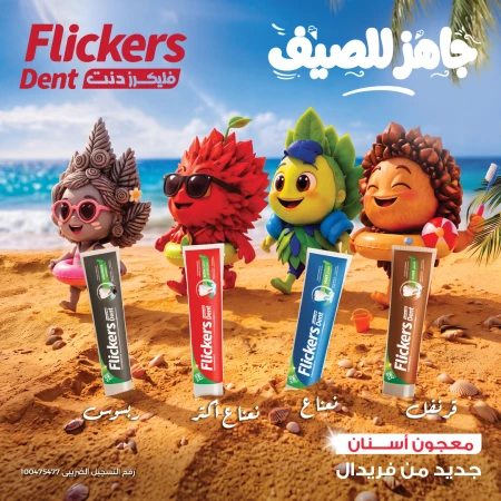
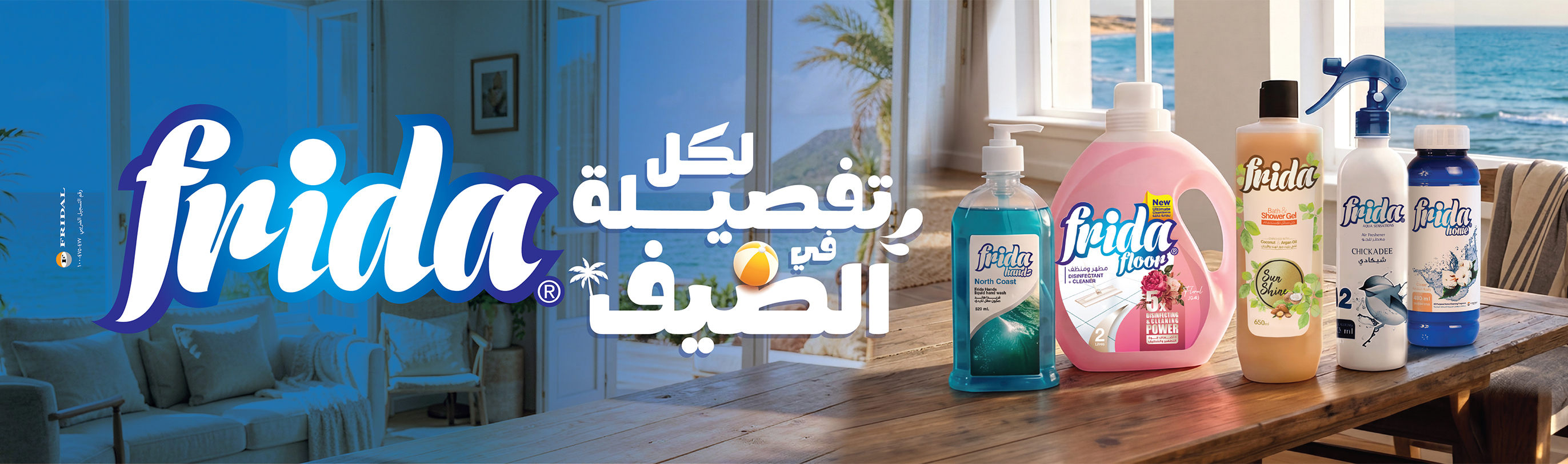
The Red Residence arrives on Cairo's billboards with a campaign that asserts luxury. Color becomes the strong storytelling tool, as the visual identity fully adopts the deep, saturated red that dominates the cityscape, from Al-Borouj Misr Developments Group. The visual identity fully adopts the deep, saturated red that dominates the cityscape, immediately drawing a line that separates this development from the neutral color palettes that usually flood real estate OOH. Colour becomes the strong storytelling tool in boldness as strategy within a crowded category for The Red Residence. It's a campaign centered around one hero: the color red. Not a muted burgundy, not a corporate maroon, but a high impact, theatrical red with black shadowing and swirling patterns that evoke drapery, smoke, or fluid motion. It's an aesthetic choice that does double duty: signals luxury without relying on gold or metallic clichés, and creates memorability when repeated at scale: bridges, mega-unipoles, arteries across New Cairo. It also imprints the development’s name through literal chromatic reinforcement: rather than just a title, “The Red Residence” becomes a visual experience. This is branding through saturation: the city turns red before the audience even processes the message. Two contrasting typographic systems lead the communication; a scripted “The Red” logotype, and an elegant, calligraphic, recognizably premium that adds a human, almost fashion-like softness to otherwise bold palettes. It reads like a signature, suggesting exclusivity and personal curation. The minimum serif/sans-serif supporting text; “Residence and the location descriptors sit in clean, modern fonts. It also balances the expressive logo with structure and legibility. It affects fog clearance even on fast-moving routes like 90 Street and Ring Road. The interaction of fancy script and subtle typography speaks to duality: extravagance with restraint, showmanship with veracity. The flowing red gradients, though abstract, are used stylistically in the drawing to mimic motion. This creates a velvet, silk, architectural curves, or even a sense of fluidity and upscale interior textures, and a dynamic background without being too static, minimalist yet high-end. Overall, it’s a story of transformation, visually supporting the tagline “Redefine Life.” When many real estate campaigns focus on features such as payment plans, metres, and amenities, this campaign decides to focus on philosophy over product and invites viewers to imagine a new standard of life over a new address. “Redefine Life” aligns perfectly with the serviced-apartment model of the project and the upscale positioning of the brand The Red Residence depends on mass repetition across key Cairo highways with long runs of consecutive unipoles, with high-frequency placements in New Cairo. Their main target zone, Scale amplifies the color strategy, the cityscape literally shifts red, building recall even before consumers consciously engage with a brand. Looking for more information about this campaign? Visit MOOH, Egypt’s and the Emirates’ OOH-dedicated Media Intelligence Company to reveal the campaign’s OOH types, sizes, budget, locations, districts, and more.