

Galaxy Flutes Celebrates the Pleasure of Crunch in Its Latest OOH Campaign

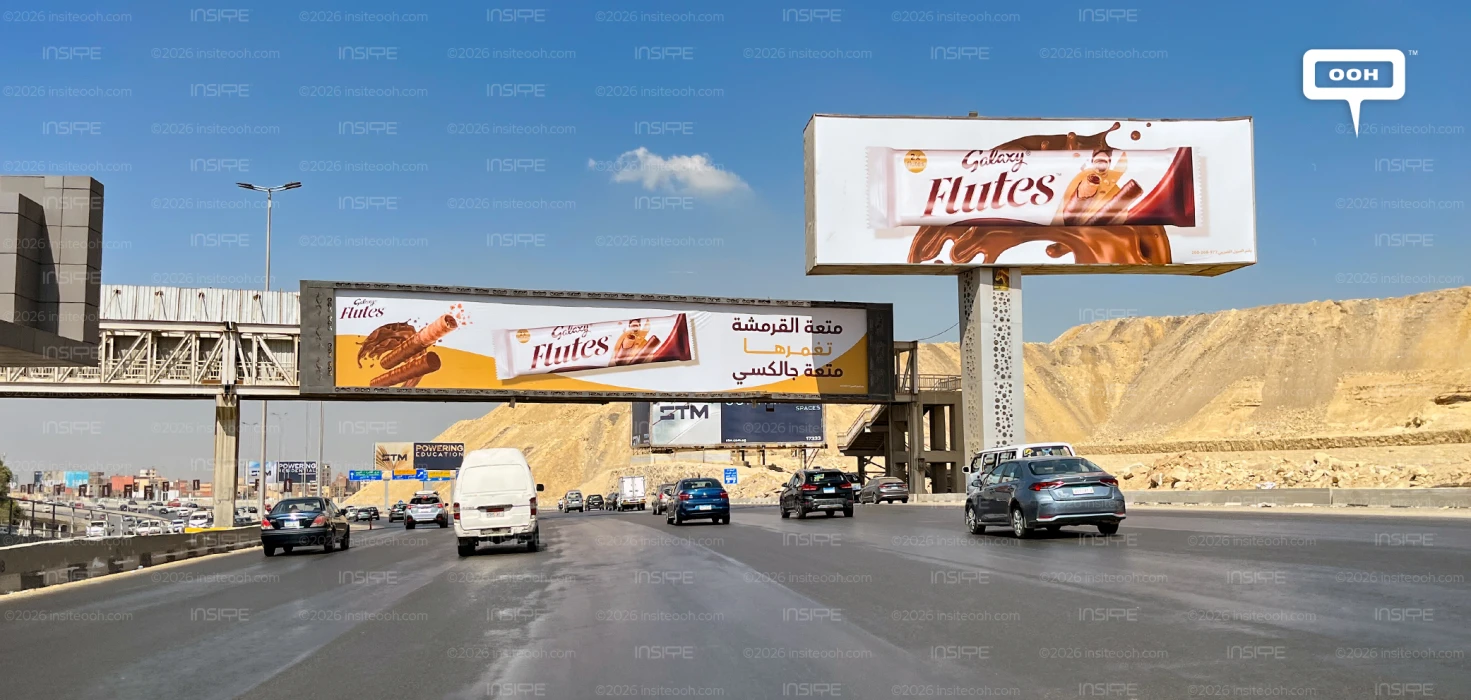
Galaxy Flutes makes texture the centre of its latest outdoor campaign, giving passing audiences a close look at the wafer beneath the chocolate. Oversized rolls, scattered crumbs and a sweeping chocolate splash turn the billboard into a product demonstration, while an Arabic headline ties the pleasure of crunch directly to the Galaxy name.
Egypt’s confectionery market was valued at an estimated US$610.2 million in 2025, according to IMARC Group. Galaxy Flutes’ latest outdoor campaign brings a specific product experience into focus within that market, using wafer crunch and chocolate imagery to build appetite appeal.
The campaign follows Galaxy’s earlier outdoor appearance, continuing the brand’s presence through a product with a distinctive shape and eating experience.
Making Crunch Visible
The most prominent feature is the enlarged product arrangement on the left. A wafer roll angles upwards, its open end revealing the layers inside, while chocolate coated rolls below establish the finished product’s appearance. Small fragments suspended around the exposed wafer suggest the moment of a bite.
That detail gives the creative its strongest sensory cue. A billboard cannot reproduce the sound of crunch, but broken wafer pieces offer a visual shorthand for it. The chocolate splash adds a contrasting impression of fluidity, allowing the artwork to suggest different textures within the same mouthful.
The diagonal arrangement also gives the composition movement. Rather than presenting the rolls as a flat product lineup, the creative brings them towards the viewer, making their cylindrical shape and layered construction easier to distinguish. The product itself becomes the billboard’s main visual event.
A Headline That Connects Texture and Brand
The Arabic copy translates loosely as “The pleasure of crunch, immersed in the pleasure of Galaxy.” Its wording connects a specific product characteristic with the parent brand, giving Flutes an identity grounded in both its wafer structure and its chocolate association.
The text appears across three lines on the right, with the middle line picked out in gold. Dark lettering above and below maintains contrast against the pale background, while the gold echoes the lower section of the artwork.
Repeating the idea of pleasure gives the message a consistent emotional register. Crunch supplies the physical sensation; Galaxy supplies the branded association. The line therefore works alongside the illustration, explaining the combination already visible in the product closeup.
Packaging Gives Appetite a Recognisable Destination
A large Flutes wrapper sits beneath the headline, balancing the unwrapped product on the opposite side. This is a useful connection: viewers see both the advertised eating experience and the packaging associated with it.
The Galaxy Flutes branding also appears in the upper left corner, giving the product name a separate point of visibility. Its repeated appearance on the wrapper reinforces identification without adding another promotional claim or a competing message.
Across the photographed billboard, the pale background leaves room around the main elements. Chocolate browns and warm gold provide the dominant colour accents, keeping the composition closely tied to the product itself. There is no prominent price offer competing with the sensory proposition.
The execution’s appeal rests on how directly it translates product texture into outdoor imagery. The wafer cross section explains the crunch, the chocolate splash communicates indulgence, and the pack connects both to Flutes. For Galaxy, that creates a clear creative proposition: make the experience of the bite visible before the audience reaches the shelf. The billboard gives that familiar purchase a specific sensory cue to remember.
Check out Monitoring Out of Home (MOOH), a specialist media intelligence agency and analysis system active in Cairo & Dubai, to learn more about this campaign.
Come on, tell us what you feel about this article.

Learn about this campaign budget, media plan, campaign data