

STM Developments Gives Kayan City a Prominent D/OOH Presence in Cairo

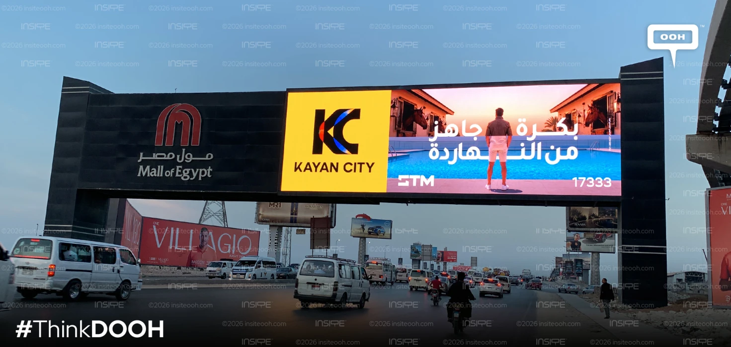
STM Developments puts Kayan City at the centre of its latest Cairo outdoor rollout, using a consistent promise across changing colours and lifestyle scenes. “Tomorrow is ready today” anchors the campaign, while the project’s prominent logo panel gives its different executions a shared identity. The commercial task is clear: build recognition for Kayan City and connect its name with a lifestyle audiences can picture.
The rollout follows STM’s “Powering” campaign, which used a recurring visual structure to introduce its activities across commercial spaces, sports and education. Kayan City brings that communication closer to the consumer, moving from the developer’s business interests towards the experience associated with a named destination.
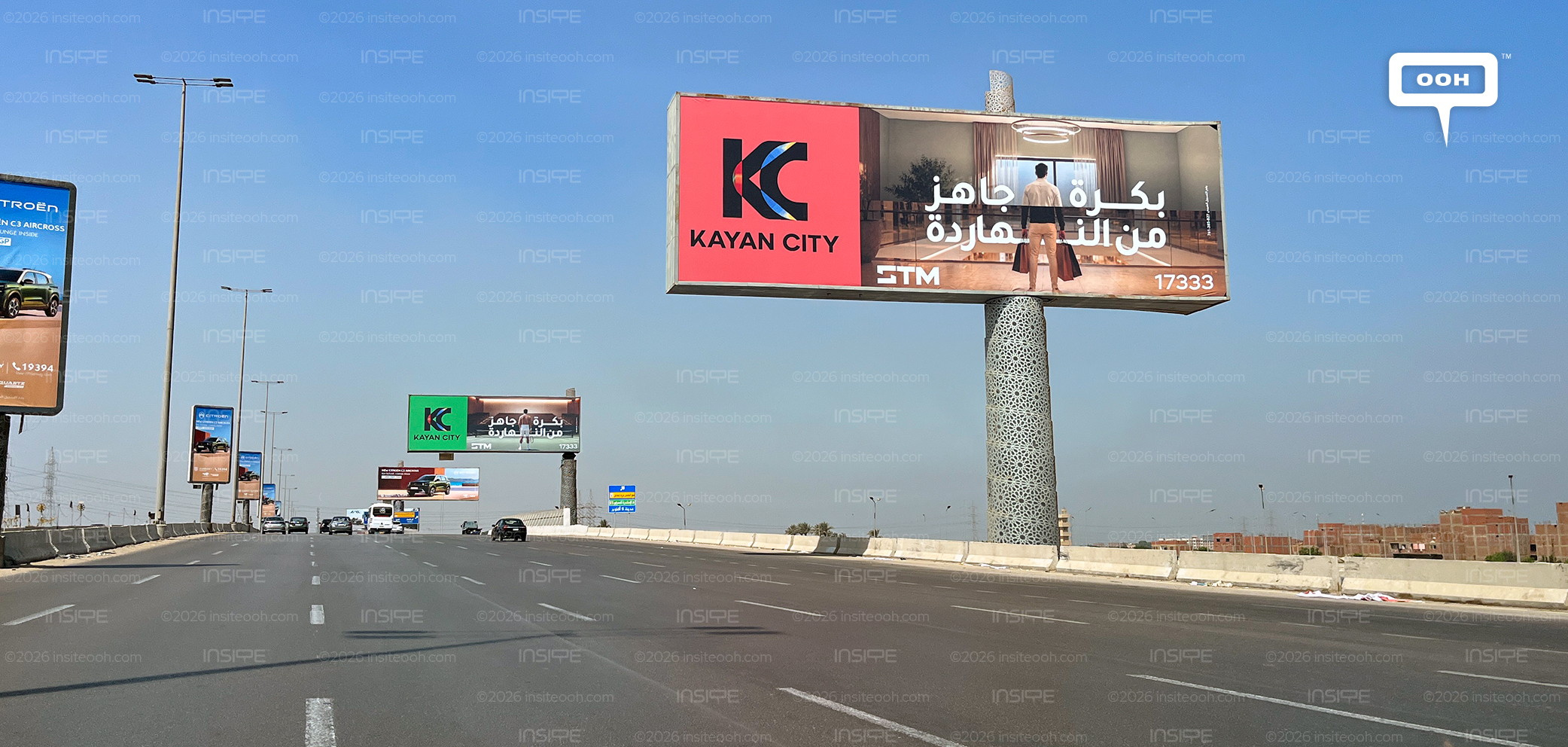
A Fixed Identity Gives the Variations Structure
Across the rollout, the core components remain consistent: the Kayan City identity, lifestyle photography, the Arabic headline and STM branding. Colour and setting provide the variation.
A coral-red execution makes that structure particularly clear. A dedicated panel occupies the left side, carrying the oversized KC symbol and KAYAN CITY name. The remaining space presents a man holding shopping bags inside a contemporary interior, with the campaign message layered prominently over the scene.
That division gives the creative two straightforward functions. The coloured panel identifies the project, while the photograph introduces an experience. Keeping those roles distinct helps the campaign accommodate different backgrounds without losing its basic organisation.
“Tomorrow” Turns an Interior into a Proposition
The Arabic headline gives the lifestyle imagery its commercial meaning. A polished interior alone could communicate several property or retail propositions. “Tomorrow is ready today” connects the scene to the idea of a future lifestyle brought within reach.
In this execution, shopping bags, warm finishes and circular ceiling lights suggest a moment within a finished environment. The person faces into the space, inviting viewers to imagine what lies ahead. That perspective gives the scene a sense of arrival, supporting the headline through an everyday activity.
The language positions readiness as part of Kayan City’s appeal. It encourages audiences to associate the project with experiences they can already imagine enjoying, giving an abstract promise about tomorrow a more concrete visual expression.
Colour Changes While Recognition Stays Anchored
The wider rollout introduces red, green, yellow and other panel treatments alongside changing photographic settings. This gives individual placements a different appearance while preserving the position and prominence of the project identity.
For a campaign encountered across multiple locations, that balance has a practical purpose. A viewer can recognise the recurring layout even when the surrounding scene changes. Each execution contributes another association with Kayan City without requiring an entirely new visual introduction.
The strategic value lies in the consistency of the logo, headline and composition. Colour provides variety within that structure, while the repeated project name keeps the different scenes connected to the same destination.
A Clear Route from Awareness to Enquiry
STM’s logo and the hotline complete the billboard, linking the project to its developer and providing a response route. The creative concentrates on recognition and lifestyle, leaving detailed sales information for a subsequent enquiry.
Kayan City’s rollout applies a repeatable structure to a specific project promise. Its strongest feature is the connection between a recognisable identity and changing scenes that give “tomorrow” something tangible to look like.
Learn about this campaign's budget, media plan, OOH kinds, and more. Just contact Monitoring Out-of-home (MOOH), the dedicated OOH media intelligence company and analysis system in Cairo and Dubai.
Come on, tell us what you feel about this article.
Learn about this campaign budget, media plan, campaign data