

Namshi Brings “Back to Namshi” to Dubai OOH

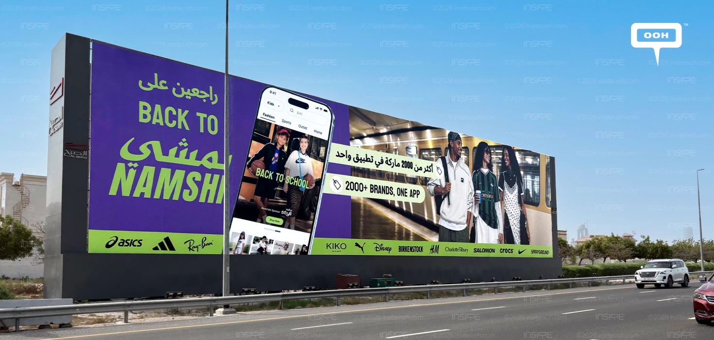
Namshi gives back-to-school shopping a broader commercial purpose in its September 2026 Dubai campaign. Across hoardings and lampposts, the fashion platform brings together a seasonal shopping occasion and its assortment promise: “2000+ Brands, One App.” On the hoarding, the largest invitation is “BACK TO NAMSHI,” placing the shopping destination at the centre of the message.
The rollout appeared during the third week of September, following an earlier November 2022 campaign promoting Namshi’s Black November cashback offers. That reference provides a useful comparison of selling propositions. The earlier campaign advertised a financial incentive; this execution gives greater prominence to brand choice and the app through which shoppers can explore it.
Back to Namshi Gives the Season a Brand Destination
Large lime lettering against a purple background makes “BACK TO NAMSHI” the hoarding’s dominant statement, supported by Arabic wording. “BACK TO SCHOOL” appears within the oversized smartphone display. This hierarchy connects the seasonal occasion directly to the platform, making Namshi itself the destination audiences are invited to revisit.
The word “back” gives the creative the tone of a return invitation, drawing on recognition of the Namshi name. For existing shoppers, that can work as a reminder to reopen the app. For new shoppers, the adjacent assortment claim supplies a reason to explore it. The seasonal message serves both audiences through the same destination.
The Smartphone Makes the Assortment Proposition Concrete
The central phone shows an app interface with a Kids selector and back-to-school content. A small “Shop Now” button appears within that display, presenting a glimpse of the shopping journey. Beside it, the bilingual “2000+ Brands, One App” message gives the interface a clear purpose: access to a broad assortment through a single destination.
The proposition joins selection with convenience. A shopper may arrive looking for a particular label, while the surrounding catalogue offers reasons to browse further. Namshi’s own app listing also describes more than 2,000 brands across categories including clothing, footwear, beauty and sportswear, supporting the breadth communicated on the billboard.
The brand strip along the bottom makes that breadth more tangible. Names including adidas, ASICS, Ray-Ban, KIKO Milano, Birkenstock and Charlotte Tilbury span different shopping interests. Beauty labels alongside footwear and fashion also show that the platform’s offer extends beyond the immediate school occasion.
Lifestyle Appeal Supports the Shopping Message
On the right, three young people appear on a train platform. Their casual styling and social interaction place fashion within everyday life, giving the execution a lifestyle dimension alongside the app interface. The scene suggests a broader view of returning to routines, encompassing personal style and social life as well as school shopping.
There is a practical limit to the amount of detail a roadside audience can absorb. The large Namshi wording and assortment statement have greater visual prominence than the small app controls and individual brand logos. Those secondary elements add detail for closer viewing; the core message remains understandable without reading every label.
The design also has to manage competing brand identities. Familiar labels can make the offer attractive, but they can leave the platform playing a supporting role. The oversized Namshi name helps keep the retailer visible alongside the brands it sells.
The campaign’s strongest commercial idea is the connection between a timely shopping occasion and a platform with wider relevance. Back-to-school content gives people a reason to look now. The assortment proposition gives Namshi something useful to communicate beyond the season: a place to find familiar brands together.
Come on, tell us what you feel about this article.

.jpg)