

RAKBANK Brings a Human Touch to Digital Banking in Dubai Campaign

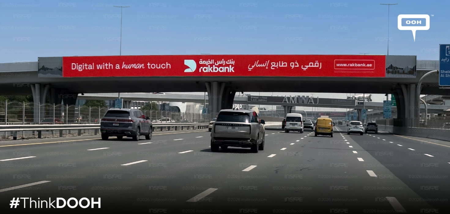
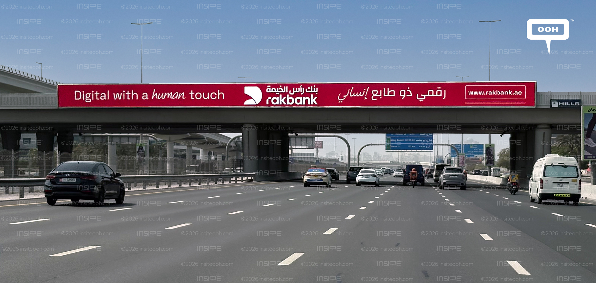
RAKBANK puts reassurance at the centre of its latest Dubai campaign. “Digital with a human touch” pairs the promise of convenient banking with the continued availability of personal support. Appearing across digital screens and bridge billboards during the third week of September 2026, the D/OOH rollout gives that positioning a deliberately uncluttered expression: red backgrounds, white lettering and a handwritten detail that makes “human” the word to notice.
The campaign follows RAKBANK’s August 2026 credit card promotion, shifting attention from a particular product to the identity behind its wider services.
A Brand Refresh with a Clear Service Promise
RAKBANK’s official introduction to its refreshed brand identifies changes to its visual identity, tone of voice and consistency across customer touchpoints. It connects those changes to a continuing commitment to digital convenience and human support. The outdoor campaign gives that broader direction a public-facing message.
That context strengthens the commercial reading of the creative. Digital banking makes routine tasks easier to complete independently, but advice and assistance still have a place in the relationship. The campaign can be read as reassurance that greater convenience will leave room for those conversations.
There is no interest rate, cashback figure or application incentive in the supplied executions. The immediate communication task is establishing how customers should understand the bank.
The Word “Human” Does the Creative Work
On the bridge billboards, the English proposition occupies the left, the bilingual bank identity anchors the centre, and the Arabic message extends across the right. A boxed website address provides a destination for further exploration.
Within that arrangement, “human” breaks from the surrounding typography through its handwritten treatment. The Arabic execution echoes this expressive approach. The design gives personal service a visible cue while keeping the rest of the communication orderly.
This is the campaign’s most useful creative decision. A short change in lettering carries meaning that would otherwise require additional copy. The bank can introduce warmth while preserving the concise message needed for a roadside encounter.
A Consistent Identity Across Different Layouts
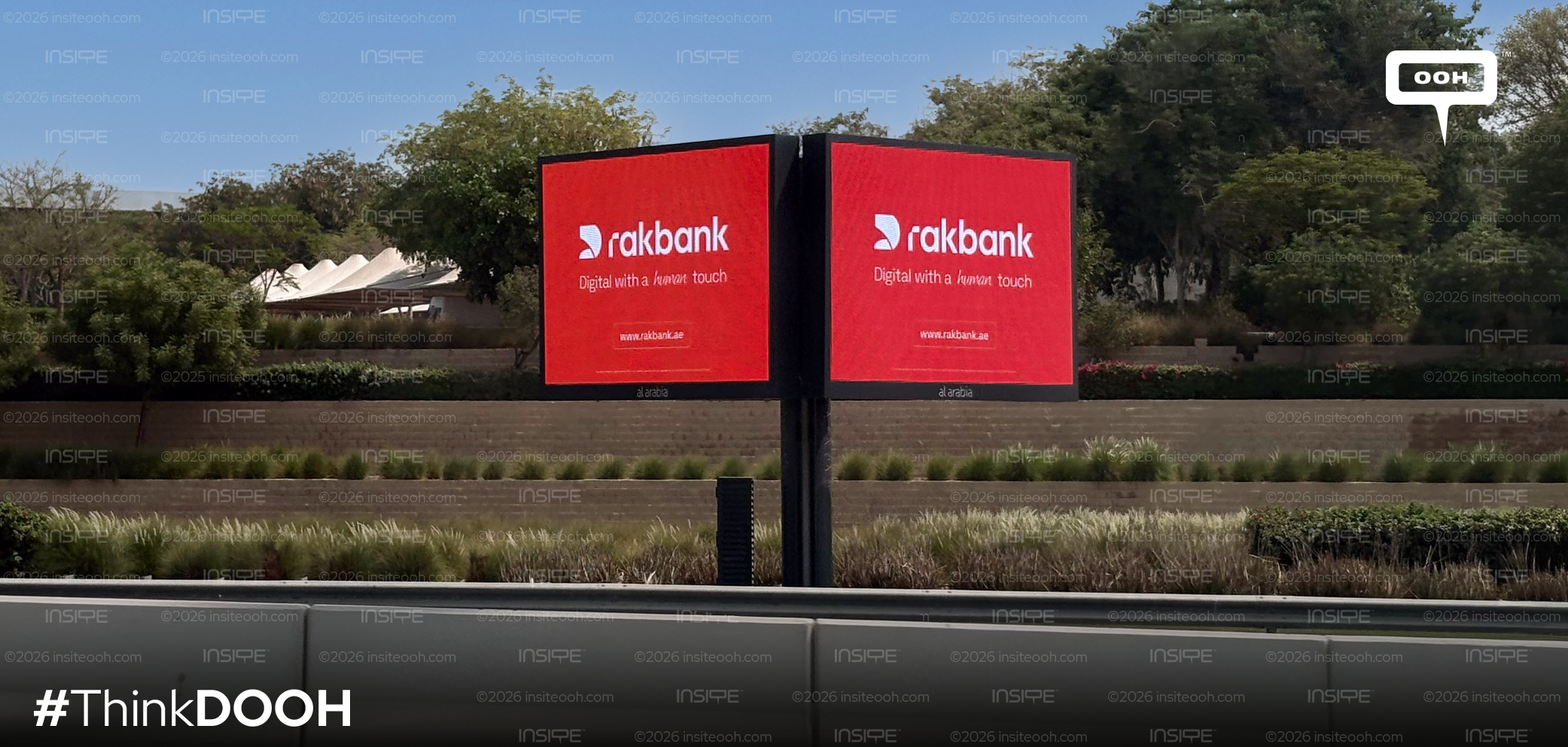
The digital-screen execution changes the hierarchy. The bank’s symbol and lowercase wordmark take the largest share of the composition, with the positioning line beneath and the website address closer to the bottom.
The bridge version distributes those elements horizontally. The screen version stacks them. Both retain the red-and-white palette and the same verbal promise, allowing the identity to remain recognisable as the proportions change.
The photographs establish these layout choices. They support an analysis of visual consistency, while audience attention and campaign effectiveness would require separate evidence.
The Promise Needs a Service Experience Behind It
RAKBANK’s mobile-banking page provides a practical connection to the message: customers can access its digital assistant, Rai, or contact the customer-service team through live chat. That combination gives the positioning a service reference beyond the artwork.
The identity also represents relationships beyond everyday consumer banking. In its third-quarter 2025 results, RAKBANK reported its first bilateral aircraft-financing deal with flydubai, illustrating the range of client needs sitting behind the bank’s name.
The creative’s restraint gives that broad institution a simple introduction. Its strongest marketing choice is making personal support part of the digital proposition itself. The next test belongs to the customer experience: whether the ease and reassurance expressed on the road are reflected when someone needs the bank.
Come on, tell us what you feel about this article.