

Miss Dior Returns to Dubai OOH With Natalie Portman at the Centre

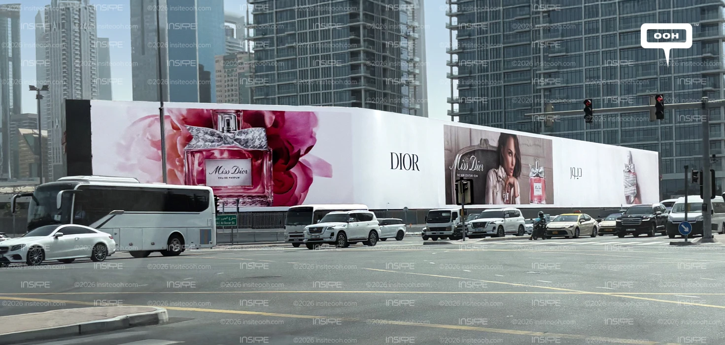
Dior gives Miss Dior a prominent presence in Dubai, pairing Natalie Portman with oversized fragrance imagery and pink blooms. Launched during the third week of September 2026 across hoardings and digital screens, the campaign uses the bottle, ambassador and Dior wordmark as complementary points of recognition. The photographed hoarding reveals its strongest creative decision: a sequence of distinct panels that gives passing audiences several ways to identify the fragrance.
A Fragrance Story Told Through Scale
At the left of the hoarding, an enlarged Miss Dior Eau de Parfum bottle sits against a cluster of pink flowers. Its textured silver bow, transparent glass and label turn familiar packaging details into prominent roadside features. The flowers surround the bottle closely, creating a visual suggestion of scent before viewers read the product name.
That is a practical response to fragrance advertising’s central challenge. A billboard cannot deliver the smell, so the creative must communicate through associations. Here, floral imagery and pink tones suggest a romantic mood, while the carefully presented packaging adds a sense of luxury. These are visual cues to the intended experience, without requiring a detailed explanation of the fragrance.
A broad white section carrying the DIOR wordmark follows the floral image. Its simplicity gives the eye a pause between the more detailed photographic panels and makes the parent brand particularly clear.
Natalie Portman Adds the Human Connection
Natalie Portman appears farther along the hoarding in a separate interior scene, alongside another representation of the bottle. Her direct gaze gives this section a different character from the floral product image: intimate, composed and personal.
The distinction matters commercially. The oversized bottle establishes what is being advertised, while Portman’s portrait introduces someone with whom audiences can associate the fragrance. Her continuing connection to Miss Dior gives the execution familiarity, supporting recognition without a lengthy campaign message.
The Miss Dior script appears within the portrait panel, keeping the fragrance name close to both ambassador and product. Elsewhere, the Arabic Dior wordmark receives its own white space. This bilingual presentation maintains the house’s restrained visual identity while giving Arabic branding a clearly defined place within the composition.
A Layout Built for Partial Views
The hoarding stretches across a busy junction, where vehicles, viewing angles and street furniture can interrupt sightlines. Its repeated product imagery and separated branding sections mean the message does not depend entirely on seeing the full surface at once.
A viewer may first notice the floral bottle, the DIOR wordmark or Portman’s portrait. Each offers a recognisable component of the same campaign. This structure makes the long frontage useful without filling every section with identical artwork.
The rollout follows Dior’s Rose des Vents campaign featuring Ever Anderson on Dubai’s digital screens. That earlier jewellery appearance provides context for Dior’s broader outdoor presence; September’s Miss Dior campaign shifts attention to fragrance and Portman’s established association with it.
The result is an awareness campaign with a clear product focus. No price or promotional offer appears in the photographed execution. Instead, Dior invests the space in making the bottle, name and mood memorable. Its strongest feature is the balance between visual richness and breathing room, giving a detailed luxury presentation a structure that can still communicate during a passing glance.
Come on, tell us what you feel about this article.