

Euphoria Group Gives Queen Valley New Cairo a Fairytale Identity
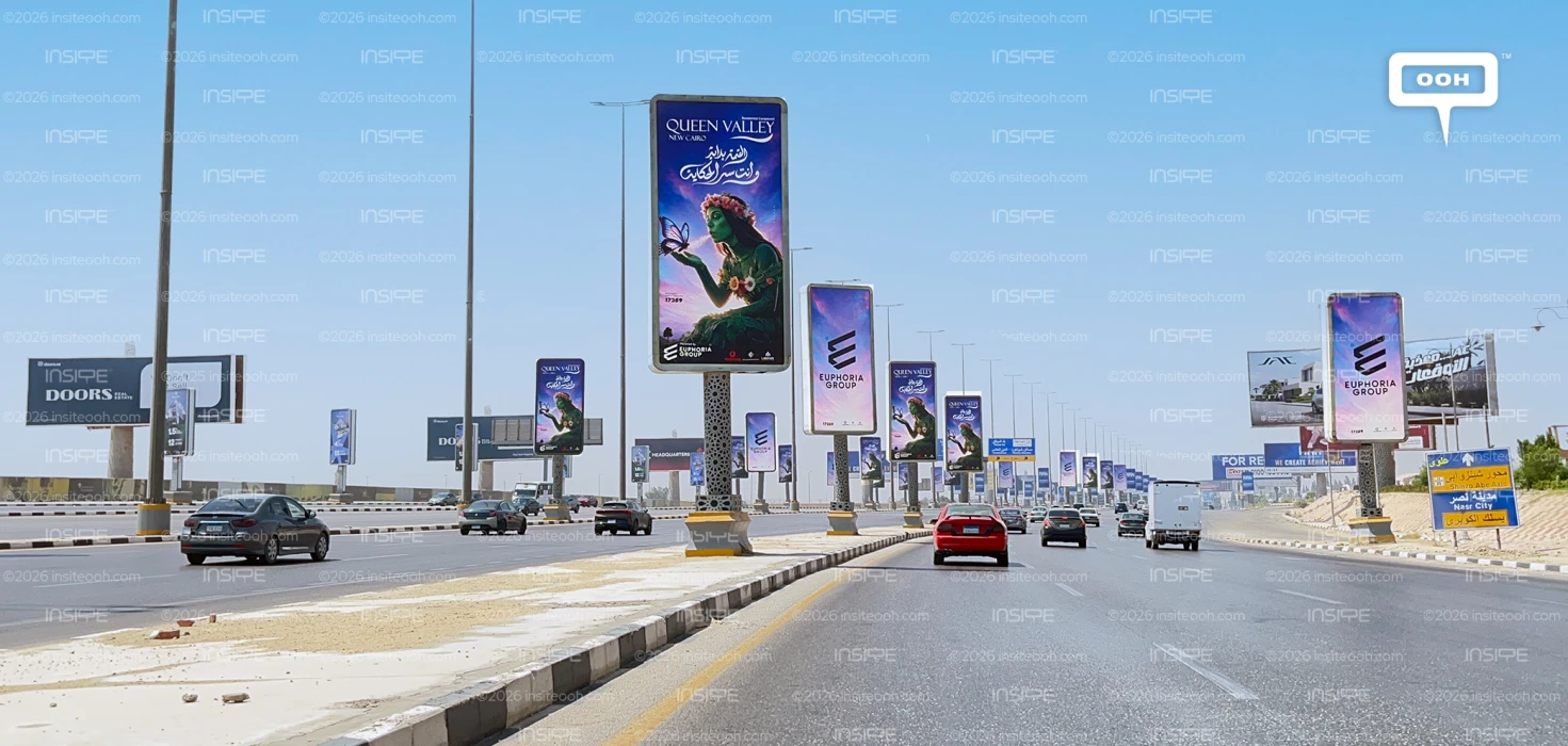
A flower-crowned figure holds out her hand to a butterfly, surrounded by a landscape washed in blue, purple and pink. Euphoria Group’s Queen Valley New Cairo campaign brings a fantasy world to outdoor advertising, giving the residential compound an introduction built around imagination. The creative invites viewers to associate the project with beauty, nature and escape before they encounter a floor plan or payment offer.
The appearance follows Euphoria Group’s previous Queen Land residential campaign. This time, Queen Valley takes the spotlight, with its name prominently positioned above a visual that gives the word “Queen” a character of its own.
Giving the Project a Recognisable Character
The central figure does much of the campaign’s storytelling. Her green complexion, leafy clothing and floral crown connect her directly to the surrounding natural imagery. The butterfly hovering above her hand adds a delicate focal point, while her gaze guides attention towards it.
For a residential brand, this is an interesting way to communicate an atmosphere. Greenery becomes a character viewers can recognise, carrying associations of tranquillity and a gentler pace of life. These are impressions created by the artwork, rather than evidence of specific project amenities.
There is also a clear connection between the illustration and the project’s name. The crown gives “Queen Valley” a visual reference, helping the name and image work together. That connection matters in outdoor advertising, where an arresting illustration has greater commercial value when people can link it back to the advertised brand.
An Invitation Into the Story
The Arabic headline translates loosely as “The queen has arrived, and you are the secret of the story.” It draws the audience into the fairytale, giving prospective residents a role within the world the campaign creates.
That wording makes the fantasy more personal. Viewers are invited to imagine themselves belonging to Queen Valley, with the emotional appeal centred on participation and discovery. The storytelling begins before the sales conversation.
The colour palette supports that invitation. Deep blue gives the upper section a strong backdrop for the white project name, while softer pink and violet tones surround the figure. Green foliage and floral details complete the scene, keeping the nature theme consistent throughout the artwork.
How the Layout Supports Recognition
The photographed vertical execution establishes a clear order: Queen Valley and New Cairo at the top, the Arabic message below, and the character occupying most of the remaining space. “Residential Compound” supplies the category cue needed to connect the fantasy imagery to a property offering.
At the base, “Powered by Euphoria Group” identifies the company behind the project, while the hotline, provides a route to enquiry. These details give the imaginative treatment a practical commercial anchor.
The creative’s strongest asset is its distinctive character. Its effectiveness will depend partly on whether viewers retain the Queen Valley name alongside that image. The prominent branding helps make that association possible.
Euphoria Group has given Queen Valley a visual idea that could carry into social content, brochures and future campaign executions. The opportunity now is to connect this memorable world with concrete reasons to consider the compound, allowing the atmosphere established outdoors to develop into a fuller residential proposition.
For more information about the types, locations, budgets, media plans, and other details of the campaign, check out MOOH, the out-of-home intelligence data provider located in Cairo and Dubai.
Come on, tell us what you feel about this article.
Learn about this campaign budget, media plan, campaign data

.jpg)
.jpg)
.jpg)