

ARABCO Gives JEEL Plaza a Retro Identity with “Built for Everyone”

ARABCO Developments gives JEEL Plaza a personality before showing its architecture. Across East Cairo, the developer’s latest OOH campaign pairs “Built for Everyone” with retro fashion, vintage cars and a blue-and-yellow palette. The project’s offer stays explicit: retail, administrative and medical spaces. The creative challenge is making that familiar property mix memorable, and ARABCO’s answer is to build the campaign around generations.
The rollout follows ARABCO’s 33-year anniversary campaign, which connected the company’s experience with a promise to future generations. JEEL Plaza gives that narrative a named destination. Read together, the campaigns suggest a progression from establishing developer credibility to introducing the product that can carry the generational idea forward.
Nostalgia Gives the Name Meaning
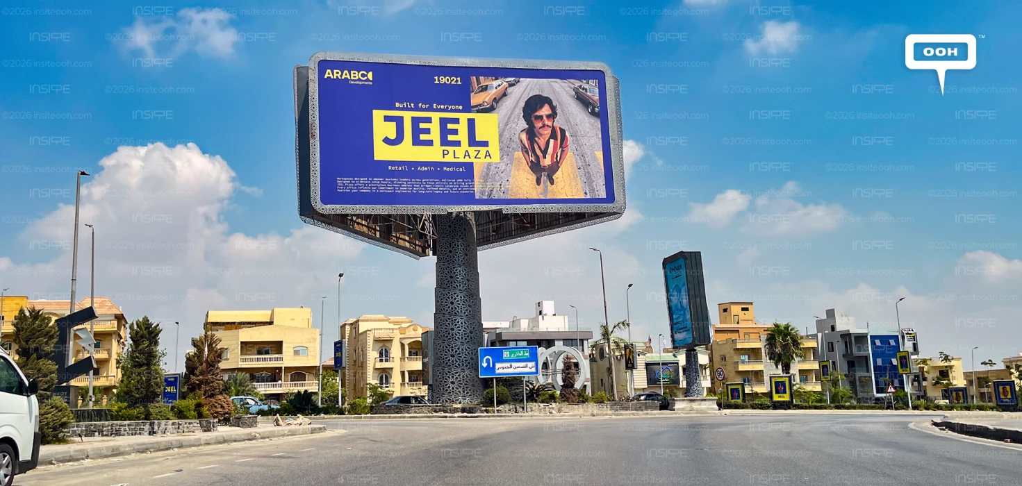
The word “jeel,” meaning generation, provides the link between the earlier message and the current creative. Here, that connection becomes visual. A moustached man in sunglasses and a striped shirt appears against a street lined with vintage cars. Another execution shows him beside a yellow car, while female portraits introduce bright clothing and geometric backdrops.
These references give the campaign a recognisable retro vocabulary. They also create a reason to look beyond the usual project name and contact number. The characters invite viewers to recognise an era, a style or something familiar from family photographs.
For marketers, the useful move is the connection between the creative device and the brand name. Nostalgia has a job: making the generational meaning of JEEL easier to remember.
“Everyone” Gets a Commercial Definition
“Built for Everyone” could become vague without a product explanation. The repeated “Retail • Admin • Medical” line gives it commercial context, presenting a destination intended to accommodate different business activities.
That combination creates distinct reasons for interest. Retailers, office occupiers and medical practitioners can identify their relevant category, while the broader slogan holds the project together under an inclusive positioning.
The campaign therefore balances character with clarity. Its imagery introduces variety, but the recurring category line keeps the proposition consistent. Viewers do not need to interpret the retro references to understand what JEEL Plaza offers.
Different Characters, Consistent Recognition
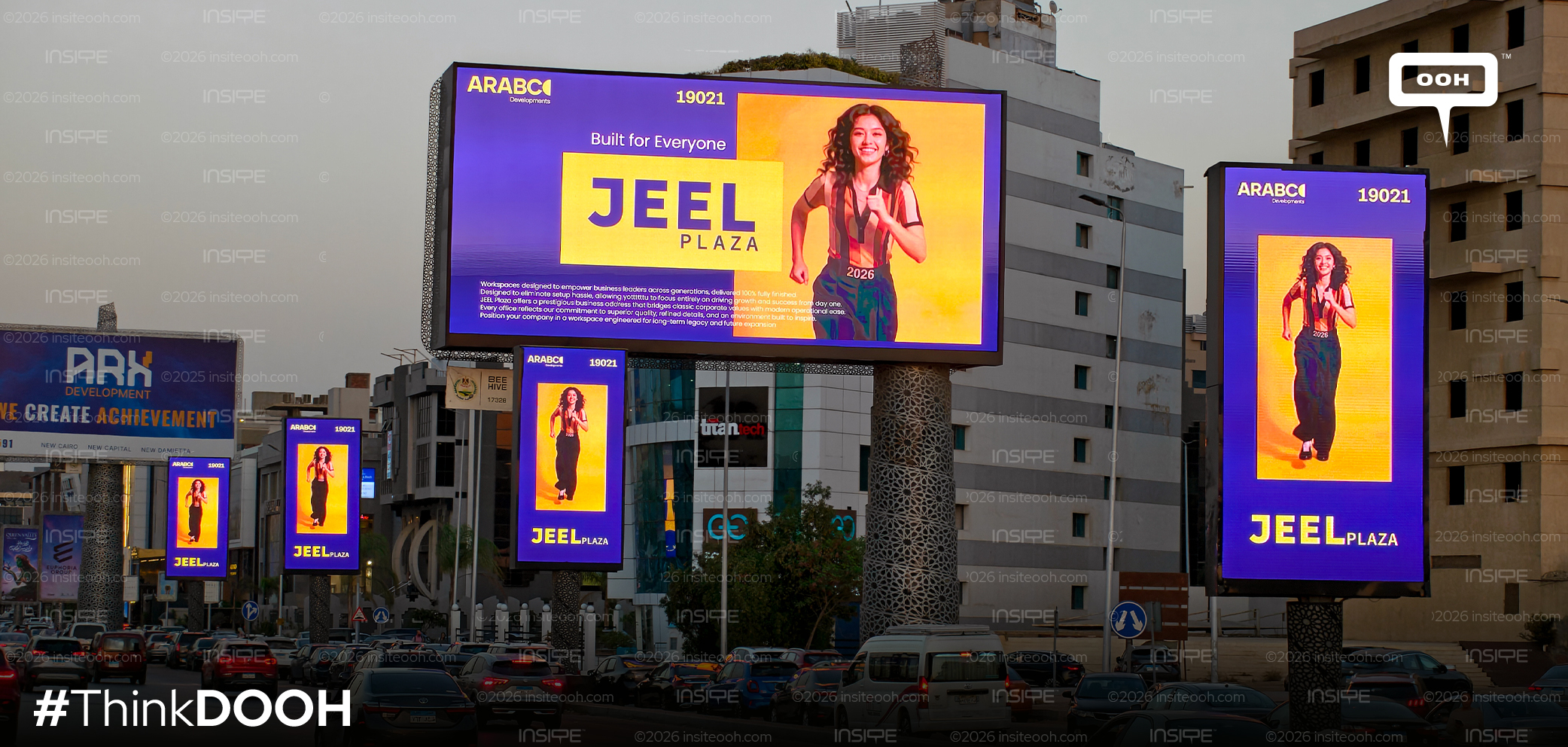
Blue and yellow connect the executions even as the portraits and compositions change. Some boards place dark lettering on yellow; others reverse that relationship. Large JEEL typography supplies the main recognition cue, supported by ARABCO’s logo and hotline 19021.
The photographed combination of large billboards and smaller vertical placements shows how the system works at different scales. Portraits can change while the colours and project name maintain continuity.
There is a practical weakness: the dense supporting copy is much less accessible at road speed. The campaign’s strongest information sits in its largest elements. The smaller paragraph adds detail, but cannot carry the central sales argument.
Building Familiarity Across East Cairo
Distribution across East Cairo gives the campaign a defined geographic focus. Repeated exposure within that area can help connect the different characters to the same project, although the photographs alone cannot establish reach or recall.
The bigger strategic opportunity lies in what follows. ARABCO has established experience, introduced JEEL Plaza and given it a distinctive visual identity. More detailed communication can now explain how its spaces serve the businesses named on the boards.
For this stage, the campaign’s strongest asset is coherence. The name, generational theme and varied cast support the same positioning, giving a standard property proposition a more ownable identity. That gives future sales messages an established creative foundation to build on locally.
Check out Monitoring Out of Home (MOOH), a specialist media intelligence agency and analysis system active in Cairo & Dubai, to learn more about this campaign.
Come on, tell us what you feel about this article.
Learn about this campaign budget, media plan, campaign data