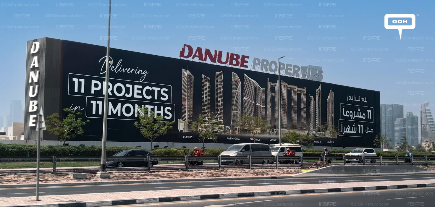
Danube Properties makes delivery the headline of its Dubai outdoor campaign, placing “Delivering 11 Projects in 11 Months” beside an illustrated skyline of its developments. Across a specially designed hoarding and wall-wrapping execution, the developer brings its portfolio under a shared message about pace and capacity. The commercial argument is clear: delivery deserves a place alongside design, location and lifestyle in how buyers assess the brand.
The wording matters. “Delivering” presents Danube’s advertised proposition without establishing that all 11 projects have already been handed over. The artwork does not identify the calendar dates covered by the 11-month period. Its role here is to communicate the developer’s delivery message, with the buildings providing a visual reference for the scale being promoted.
From Greenz’s Residential Offering to Danube’s Wider Portfolio
The campaign follows Greenz by Danube’s earlier Dubai appearance, which introduced a townhouse and villa community through residential renders and product details, including fully furnished units and an advertised starting price of AED 3.5 million. That execution gave audiences a particular development to consider.
The delivery campaign broadens the conversation to the company behind those developments. Read together, the campaigns address complementary parts of the purchase decision: interest in a residential offering and confidence in the developer’s ability to execute. That makes the portfolio message commercially relevant beyond the individual projects pictured.
A Repeated Number Gives the Message Structure
The creative’s strongest device is the repeated “11.” Large white lettering places the project count and delivery duration inside outlined boxes, creating a compact relationship between volume and time. The handwritten “Delivering” introduces the statement, while the heavier typography gives the numerical claim priority.
A black background holds the composition together, allowing the pale architectural drawings and white copy to remain distinct. English and Arabic versions occupy opposite ends of the installation, each giving viewers an entry point into the same proposition.
Brand identification also operates across different parts of the structure. Danube Properties lettering rises above the main face, while vertical branding occupies the left return. This gives the company name a presence beyond the headline area and makes the installation’s physical shape part of the communication.
The Skyline Supports the Claim, but Detail Has Limits
The illustrated towers give the numerical message a recognisable architectural context. Their differing silhouettes suggest breadth across the portfolio, while small project labels invite closer inspection.
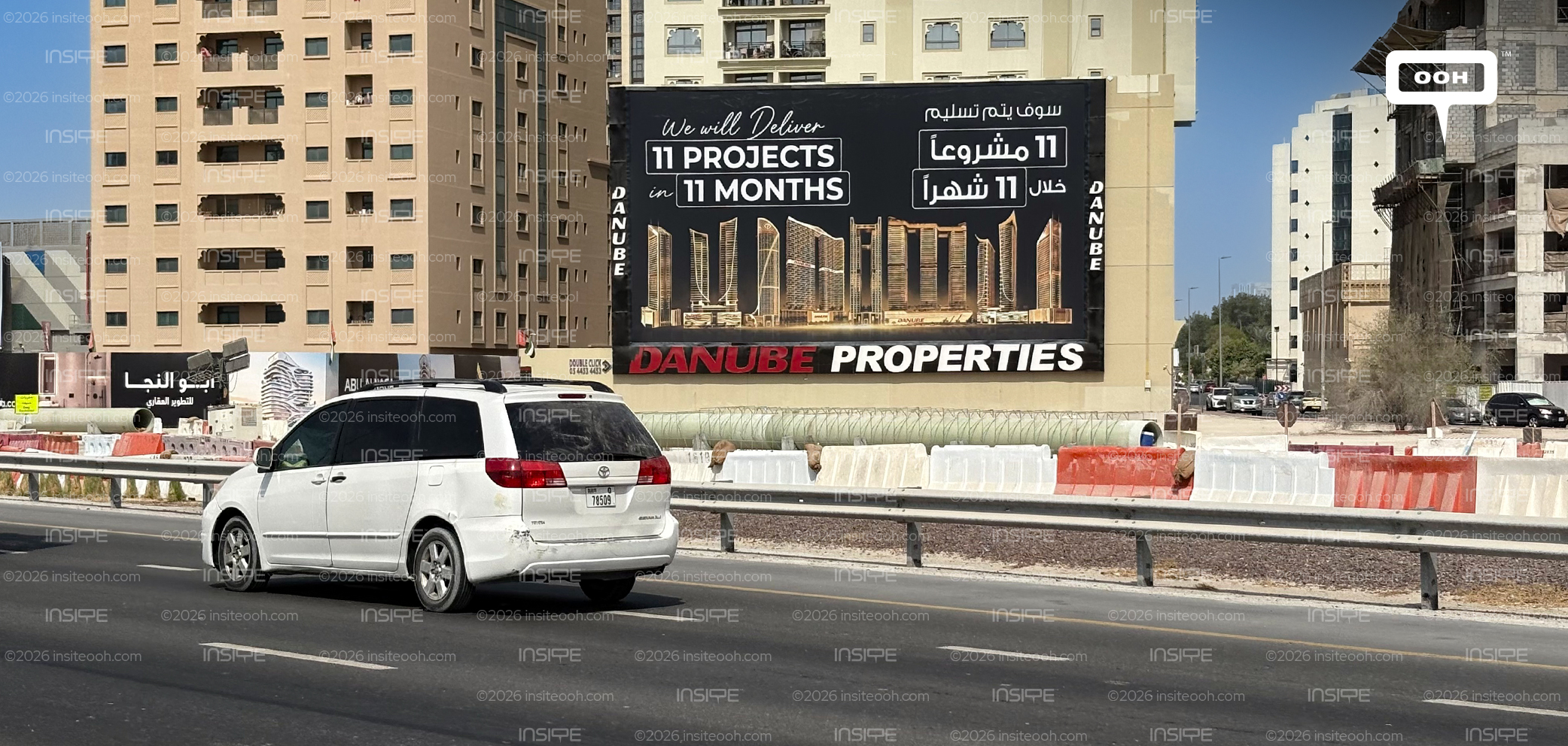
The hierarchy involves a practical trade-off. The main claim is substantially easier to pick out than the individual development names. In the supplied photograph, trees and roadside infrastructure also interrupt parts of the lower artwork. The skyline therefore works most effectively as a collective impression of the portfolio; its finer details require more viewing time.
That distinction helps explain the execution’s central strength. Viewers can take away the developer’s name and delivery proposition without identifying every building. For Danube, the strategic opportunity is to make delivery capability part of brand recall, supporting future project advertising with a broader reason for buyers to pay attention.