

Arclyn Developments Launches Its Awareness Rollout for The Arc Shaping 2 Lyns
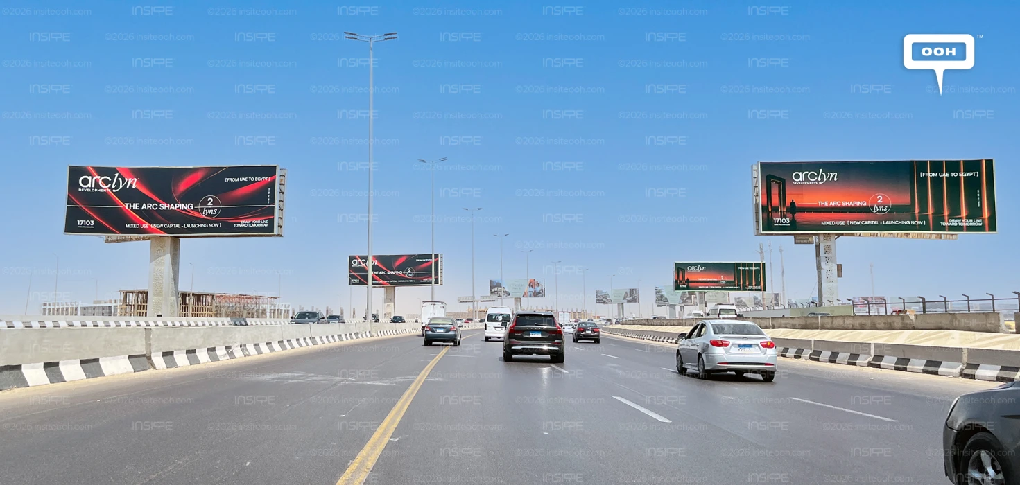
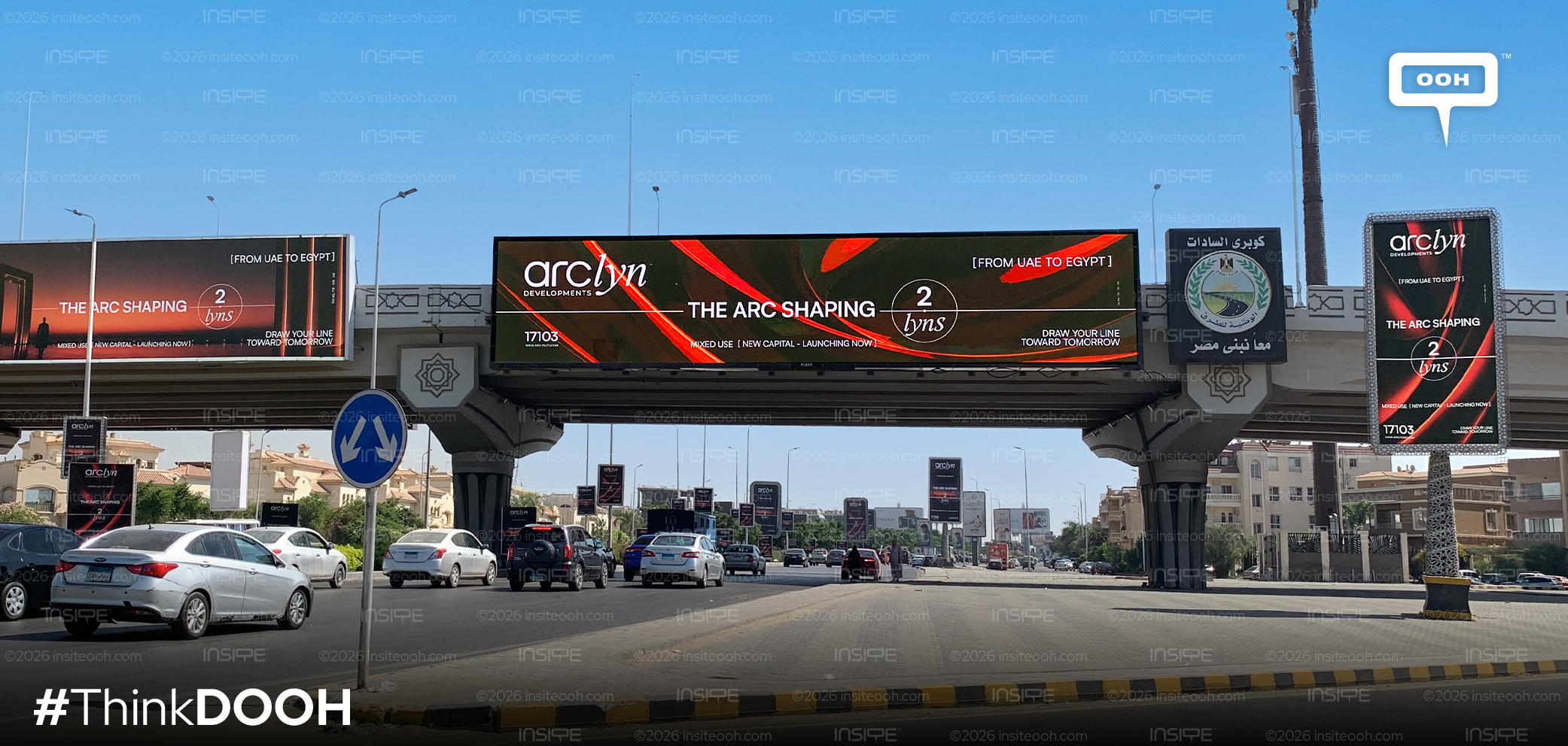
Arclyn Developments brings 2 Lyns into focus through an outdoor campaign announcing a mixed-use project in Egypt’s New Capital. “The Arc Shaping 2 Lyns” leads the creative, supported by the concise description “Mixed Use, New Capital, Launching Now.” Across East Cairo, the rollout gives the developer’s architectural visual identity a specific project to introduce.
The campaign follows Arclyn’s “Where Line Shapes Tomorrow” introduction. Its recurring lines, arches and warm colours connect the developer’s earlier brand message with the 2 Lyns name, creating continuity as the communication moves towards a project launch.
From Developer Identity to Project Recognition
The most significant addition is the project name itself. The supporting copy then answers two immediate questions: what type of development is being introduced, and where is it located?
“Launching Now” adds a timely reason to notice the announcement. The supplied executions contain no price, down payment or instalment plan, keeping the emphasis on identifying 2 Lyns and associating it with Arclyn.
This gives the campaign the character of a project-awareness launch. The creative establishes a name, category and location, leaving the detailed commercial proposition for further communication. It does not, however, establish what the next campaign will contain or how the developer’s wider sales activity is structured.
The headline also links the developer and project through wordplay. “The Arc Shaping 2 Lyns” draws on the Arclyn name while introducing 2 Lyns, making the relationship between them part of the central message.
Arcs and Architecture Connect the Executions
The campaign uses two visual treatments. In one, red-and-orange arcs sweep across a dark background, giving the architectural line motif a prominent graphic role. The other places a lone figure before a monumental arch at dusk, with the structure reflected in water below.
These compositions approach the same identity from different directions. The abstract arcs emphasise shape and colour, while the architectural scene introduces scale through the contrast between the figure and the surrounding structure.
The arch scene functions as an expression of the campaign’s design language. Without further project information, it should not be treated as a confirmed representation of what 2 Lyns will look like.
Consistent typography, colour and wording hold the executions together across the uni-poles. That repetition gives viewers recurring visual cues through which to associate the new project name with Arclyn’s earlier introduction.
East Cairo Locations Support the New Capital Message
The supplied rollout locations include Thawra Street, 90th Street, Tagamoa, Ring Road, Mosher and Rehab. These placements establish a presence across East Cairo, giving the New Capital announcement a geographic context within the wider eastern side of Greater Cairo.
The location list supports an assessment of where the campaign appears. It does not establish the audience profile or prove a specific targeting strategy. Its relevance to the creative is more direct: the boards repeatedly pair the 2 Lyns name with “New Capital,” keeping the project’s location within the main message.
Arclyn’s strongest decision is the continuity between its corporate introduction and the project launch. The visual identity remains consistent as the information becomes more specific. The next communication opportunity is to explain what distinguishes 2 Lyns within the mixed-use category, giving prospective customers reasons to move from recognising the name to considering the project.
For campaign formats, locations, budgets and media-plan information, visit MOOH, the out-of-home intelligence provider covering Cairo and Dubai.
Come on, tell us what you feel about this article.
Learn about this campaign budget, media plan, campaign data

.jpg)