

Emirates Islamic Makes 6% the Focus of Its New Creative UAE OOH

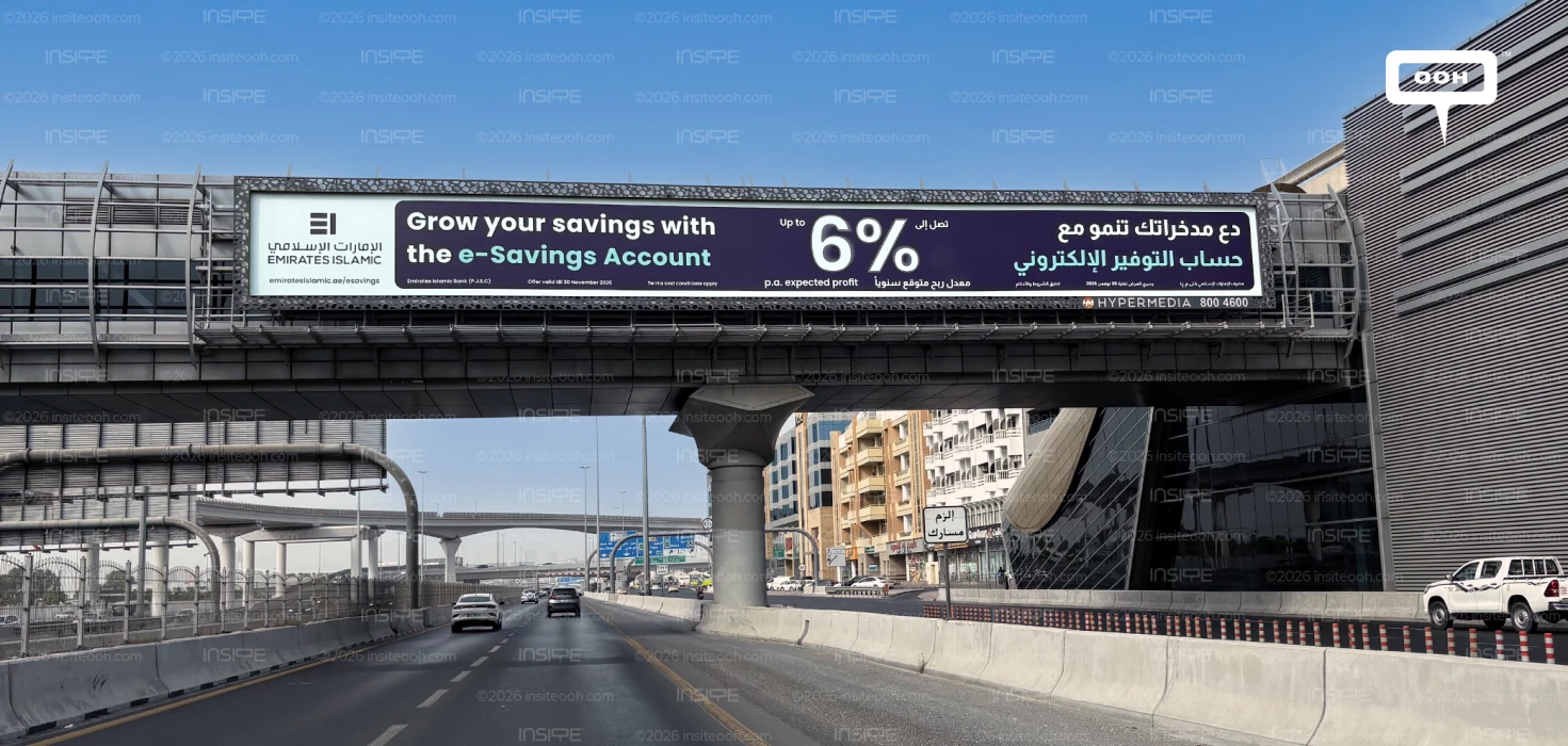
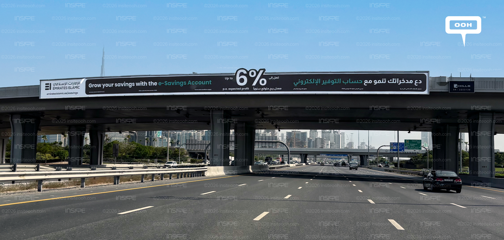
Emirates Islamic brings its e-Savings Account to Dubai’s OOH landscape during the second week of September 2026, using bridge billboards to promote up to 6% p.a. expected profit through a typography-led bilingual campaign.
Rather than relying on lifestyle photography or product imagery, the execution turns the financial proposition itself into the creative. The Emirates Islamic identity, e-Savings Account message and oversized percentage figure do most of the communication, giving road audiences a clear product benefit within a limited viewing window.
Emirates Islamic Puts the Financial Offer First
The campaign’s strongest visual element is the up to 6% p.a. expected profit message.
Its scale gives motorists a single figure to register quickly, while the headline, “Grow your savings with the e-Savings Account,” explains the product behind the number.
This creates a simple communication hierarchy. The account name establishes what is being promoted, while the percentage provides the immediate reason to pay attention.
The qualification around the figure is equally important. “Up to” and “p.a. expected profit” remain visible alongside the headline number, ensuring that the financial claim is presented with its necessary context rather than operating as an isolated percentage.
Smaller terms and conditions provide an additional information layer for audiences with longer viewing time, while the main proposition remains understandable at a glance.
A Banking Campaign Built Without Lifestyle Imagery
Emirates Islamic avoids the familiar banking approach of using people, aspirational settings or lifestyle photography to support the product.
Instead, the billboard operates more like a large-format financial announcement.
A deep purple background creates a strong base for the white typography, while turquoise accents help separate different parts of the English and Arabic messaging. The limited visual palette keeps attention on the information rather than introducing decorative elements that could compete with the offer.
That restraint works in favour of the product. In this case, the commercial benefit is strong enough to become the central visual device.
English and Arabic Share the Same OOH Execution
The creative presents both English and Arabic within one continuous layout, allowing Emirates Islamic to address a broad Dubai roadside audience without dividing the campaign into separate executions.
The English product message introduces the e-Savings Account, while the Arabic copy carries the same core proposition across the opposite side of the billboard.
Between them, the up to 6% p.a. expected profit figure acts as the common reference point.
This bilingual structure is particularly suited to the bridge billboard format, where the extended horizontal surface provides enough room for both languages to remain legible without compressing the core message.
Why Bridge Billboards Suit the e-Savings Message
The bridge billboard format gives Emirates Islamic enough width to organise a relatively information-heavy banking proposition without making the execution feel crowded.
The brand identity, product message, financial figure and bilingual copy can each occupy a defined part of the surface while still reading as one campaign.
That matters for a financial product, where clarity can be more valuable than visual complexity.
A passing audience does not need to absorb every line to understand the basic proposition. The bank is promoting an e-Savings Account with up to 6% p.a. expected profit, and the visual hierarchy makes that information accessible within seconds.
Turning the Proposition Into the Creative
The strength of the campaign lies in how little it needs beyond the product itself.
Emirates Islamic uses the e-Savings Account name, a prominent financial figure, bilingual messaging and a restrained brand system to carry the entire execution.
Instead of surrounding the offer with lifestyle storytelling, the campaign places the commercial proposition directly at the centre of the billboard. For a roadside banking message, that gives the creative a clear purpose: communicate the account, establish the benefit and make the key figure difficult to miss.
Come on, tell us what you feel about this article.