

Gracie Abrams Fronts Chanel’s Coco Mademoiselle Crush Absolu D/OOH Campaign

Chanel brings Coco Mademoiselle Crush Absolu outdoors with an expansive creative pairing Gracie Abrams with an oversized fragrance bottle, using dark tones and soft pink accents to frame the launch.
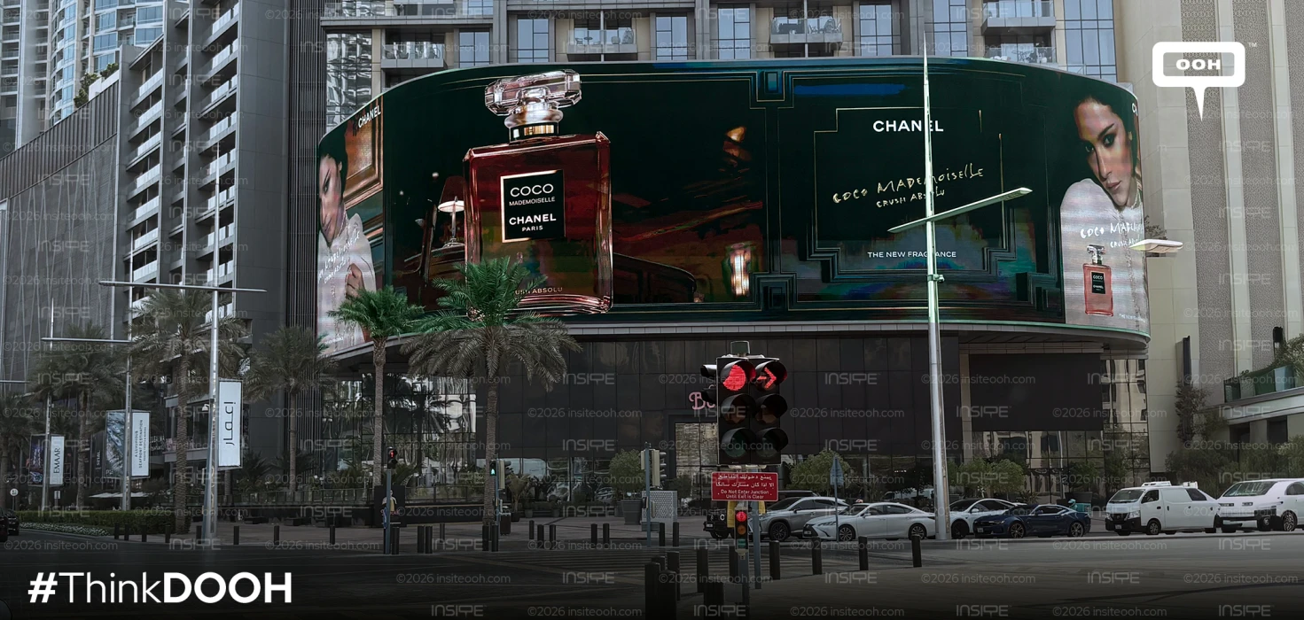
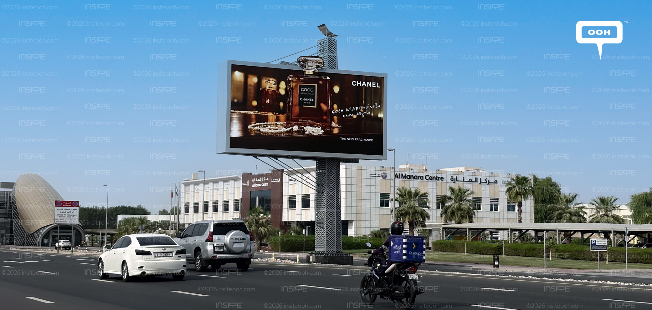
Appearing on digital screens and unipoles, the campaign gives the fragrance a prominent outdoor presence while keeping its message selective. Chanel’s name, the bottle, the Coco Mademoiselle identity and “The New Fragrance” establish the essentials. The creative leaves the surrounding imagery to communicate character, building an atmosphere around the product without asking passing audiences to absorb a lengthy explanation.
A Bottle That Commands the Composition
The photographed curved display places an enlarged bottle against a dimly lit interior, where decorative wall panels and warm reflections create depth. Its pink liquid and transparent stopper stand out against the darker backdrop, making the packaging a natural focal point. The bottle’s scale also gives viewers a clear product reference within an otherwise cinematic scene.
Abrams appears towards the outer sections of the display, her pale pink clothing softening the composition. This arrangement allows the portrait and product to occupy distinct areas while remaining connected through colour and lighting. Across the broad central section, Chanel’s white lettering provides a sharper visual anchor, while the handwritten treatment of Coco Mademoiselle introduces a more personal, expressive note.
The contrast matters outdoors. Large imagery can register quickly, while smaller details reward a longer look. Here, the bottle silhouette and Chanel name carry the immediate recognition task. The finer fragrance lettering contributes to the mood, although its readability naturally depends on viewing distance and the conditions around each placement.
Gracie Abrams Extends the Campaign’s Story
The outdoor imagery sits within a wider launch starring the singer. Chanel’s accompanying campaign film, directed by Joe Wright, follows Abrams through a nighttime Parisian adventure, including a café scene. That context helps explain the outdoor execution’s intimate lighting and atmospheric setting: the billboard offers a concentrated glimpse of the world built around Crush Absolu.
For the outdoor audience, however, the execution needs to communicate independently. Abrams supplies a human point of connection, while the enlarged bottle keeps the fragrance central. The relationship between those elements gives the campaign both a recognisable face and a tangible product identity, allowing its celebrity association to support the launch message.
From Rouge Coco to Coco Mademoiselle
The rollout follows Chanel’s earlier Rouge Coco Hydra Gloss outdoor campaign in the UAE, which used a divided billboard composition for its debut. The latest campaign continues that interest in distributing attention across a large advertising surface, this time through a fragrance bottle, portrait imagery and a dedicated branding area.
Digital screens and unipoles give this visual language different viewing contexts. Digital placements accommodate luminous imagery and expansive compositions, while unipoles offer elevated roadside visibility. Across both formats, maintaining a clear hierarchy between brand, bottle and fragrance name is essential to preserving the launch’s readability.
The campaign’s strongest creative decision is the prominence afforded to the packaging. Even within an elaborate setting, the bottle remains easy to identify and closely connected to the Chanel name. For a fragrance advertised in a medium that cannot convey scent, that visual association carries particular importance. Crush Absolu reaches the street through a distinctive colour palette, familiar branding and a carefully staged encounter between its product and its new face, framed for public visibility.
Come on, tell us what you feel about this article.