

EGYPTAIR Puts Its FC Barcelona Partnership in the OOH Spotlight

FC Barcelona’s colours meet EGYPTAIR’s signature Horus emblem in an outdoor campaign spotlighting the carrier’s role as the official airline partner of the club’s first team.
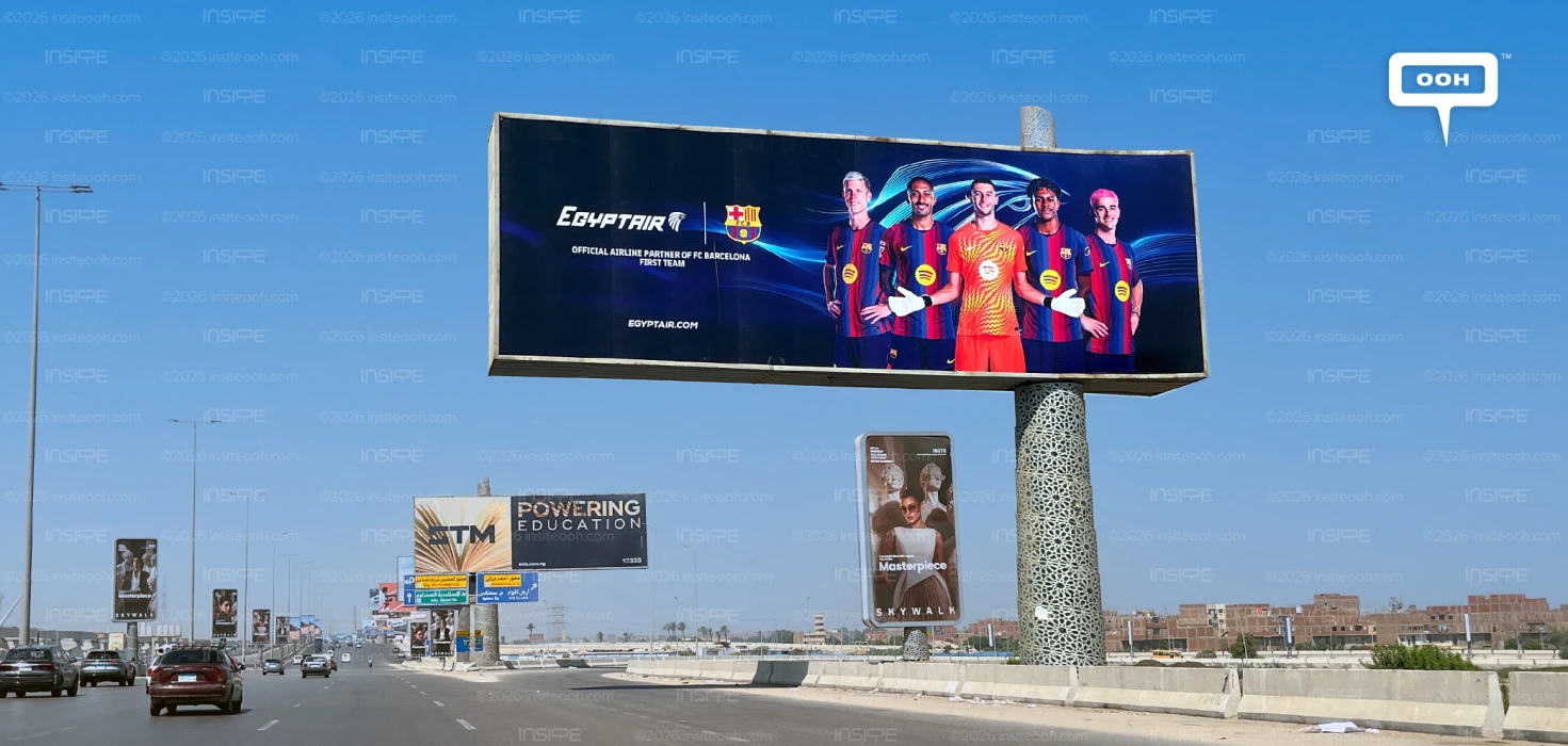
The billboard puts football at the centre of the airline’s communication, pairing five players with an oversized interpretation of its familiar emblem. Against a deep navy background, Barcelona’s red and blue shirts provide the strongest colour contrast, while the EGYPTAIR logo and club crest sit together on the left. The partnership itself supplies the headline, giving the creative a single, clearly defined subject.
Football Leads, but the Airline Holds Its Ground
The players occupy most of the layout, creating an immediate point of recognition for supporters. Their front-facing poses give the image the character of a team portrait, with the goalkeeper’s orange kit breaking the rhythm of the striped shirts. His outstretched gloves widen the central figure’s silhouette and add movement to an otherwise composed lineup.
Behind them, a large blue Horus graphic sweeps across the background. This is an important decision for the advertiser: the airline’s identity extends beyond the relatively small logo into the space occupied by the footballers. The flowing lines visually connect the two sides of the billboard, helping the composition feel like a shared identity rather than separate logos beside a player photograph.
The dark background also gives the white EGYPTAIR wordmark a clear setting. Although the players command attention, the airline retains a distinct area of the layout, with enough separation to keep its name visible.
A Partnership Statement Does the Talking
The copy reads “Official Airline Partner of FC Barcelona First Team,” translating the relationship into a concise statement beneath the club crest. Its wording identifies the specific team association being promoted, keeping the message focused.
There is no fare, destination offer or promotional deadline in the pictured execution. EGYPTAIR.COM appears near the bottom, providing a reference point without turning the billboard into a booking advertisement. The immediate objective suggested by the artwork is familiarity with the partnership, supported by a recognisable football identity.
That approach changes what the audience is being asked to remember. The creative foregrounds who the airline is associated with, leaving the practical details of flying outside the frame. For viewers who recognise the club, the shirts, crest and players supply context before the smaller copy is read.
The Roadside Test: Recognition Before Detail
The layout has a straightforward viewing order: the player lineup draws attention, the paired identities establish the brands, and the partnership statement explains the connection. Its limited copy gives each element a defined role within the broad horizontal space.
There is a trade-off, however. The partnership wording is considerably smaller than the player imagery, making the exact relationship less prominent than the football association. From a distance, viewers may register EGYPTAIR and Barcelona before absorbing the first-team designation. The visual hierarchy favours immediate recognition over more detailed reading.
The campaign’s most effective visual choice is the enlarged Horus emblem. It gives the airline an active presence within a scene that could easily belong entirely to the club. Barcelona provides the faces and colours; EGYPTAIR shapes the backdrop around them. As an outdoor expression of the partnership, the billboard makes that relationship visible through composition, giving the carrier a place in the football image as well as beside the crest.
Check out Monitoring Out of Home (MOOH), a specialist media intelligence agency and analysis system active in Cairo & Dubai, to learn more about this campaign.
Come on, tell us what you feel about this article.
Learn about this campaign budget, media plan, campaign data
.jpg)